


From numbers to narrative: A more fluid approach to data use

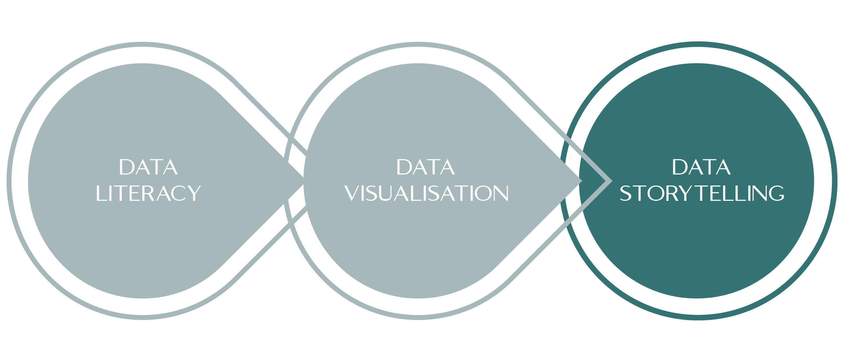
When it comes to operationalising data use across an organisation, I use three interconnected focus areas - data literacy, data visualisation, and data storytelling - to inform and guide my work. While data storytelling may be the ultimate goal (as this is where we draw insights and communicate meaning) it's important not to view these three areas as linear steps; rather, they are dynamic, interdependent capabilities that evolve and interact over time.
Even in organisations with strong skillsets across all three areas, change is a constant… new data sets emerge, roles change, teams expand, and people are promoted into positions with different demands. As these things happen, we may need to return to foundational questions, learn about new data types and/or expectations, revisit how data is being presented, or reframe our communication to bring others along. Building a confident, data-informed culture requires the flexibility to move back and forth between these domains… not as a failure, but as part of an adaptive, reflective data practice.
Data Literacy: Unveiling the Meaning Behind the Numbers
At the heart of any meaningful engagement with data lies data literacy, as it’s the foundation on which all other data use is built. Without a functional understanding of what the numbers mean, what they measure, how they’re calculated, and why they matter, we struggle to engage with data in any purposeful way. And yet, many people (including those in leadership roles) feel underprepared and under-confident when it comes to using the data they’re expected to interpret and act upon.
A 2018 Gartner survey identified poor data literacy as the second most significant barrier to success in organisations, and I see this finding continually reflected in practice. People often don’t understand the numbers they’re being asked to use, and when there’s pressure to appear confident, it becomes even harder for them to ask questions or seek support from others. This becomes even harder for leaders who are sometimes expected to know a lot about a lot of things!
Improving this begins with dismantling the assumption that everyone already ‘gets it’. Building data literacy is not about turning every team member into an analyst, or expecting people are told once and they’ll be able to use the data well from here on in, it’s about equipping people with the skills to ask the right questions, interpret key metrics, and understand the implications of the data in their context.
Charles Seife’s book Proofiness: How You’re Being Fooled by the Numbers captures this idea beautifully. He explains how a number like “five” holds no real meaning until it’s anchored in a specific context. This applies to all our data: meaning is not inherent in the number, rather it’s something we build through understanding, comparison, and interpretation. As leaders, we have a responsibility to build this understanding… both in ourselves and in the people we lead.
Data Visualisation: Transforming Numbers into Insight
Once we’ve built confidence in understanding data, the next key capability is data visualisation. While the adage “a picture is worth a thousand words” is often overused, it is relevant in this context. Whether it’s a bar graph, a heatmap, or an infographic, a well-crafted data viz can surface patterns, outliers, and insights in ways raw data simply cannot.
However, data visualisation is not just about what we see; it’s about how well we understand what’s being shown. Too often, we settle for the default chart types like bar and line graphs, without asking whether they’re the best fit for the story we’re trying to tell. More nuanced visualisations like scatter plots or box-and-whisker charts can offer powerful insights, but they’re not commonly understood, which can create further disconnects between the data and real action.
When it comes to data viz, clarity must always come before complexity. Whether we’re building our own visuals or commissioning them from someone else, we need to ensure they are accessible and purposeful. A strong visualisation should guide the viewer toward the most relevant trends or comparisons, it should not overwhelm them with noise, irrelevant data, or a confusing colour-scheme. When done well, data visualisation becomes a bridge between numbers and narrative, and they become an essential support to both inquiry and decision-making.
Data Storytelling: Leading Change Through Narrative
At its most powerful, data becomes a story… not in the sense of embellishment, but in the sense of meaning, coherence, and purpose. This is the domain of data storytelling, and it’s where we move from raw insight to collective understanding.
In his book Effective Data Storytelling, Brent Dykes highlights the importance of communicating insights in ways that resonate with an audience. This doesn’t always mean a formal presentation; it might be a well-framed conversation in a team meeting, a paragraph in a report, or a compelling visual in a slide deck. But in my world, I focus a lot on the data storytelling that we DON’T do for an audience… The data stories we tell about our own data, in our own sphere of influence, with our own people. In this way, I see data storytelling as being about answering two questions: What does the data tell us (what trends and insights can we see)? And what should we do next?
Crucially, data storytelling isn’t a final step, but it’s an ongoing practice. We are constantly learning, iterating, and adjusting, and new data brings new questions, and new decisions. And at the core of all this is the ability to look for patterns and insights, prioritise the importance of these patterns and insights, and be able to make good decisions about what to do with the information.
Bringing It Together: A More Agile, Human Approach to Data Use
A participant on a Quik webinar in 2019 said that 80% of our time is spent collecting and preparing data, with only 20% left for insight and action. That ratio tells us everything we need to know about what needs to change. If we want to make better decisions, and build a culture where data is truly embedded, we need to shrink the collection and preparation time, and focus on the doing. To do this, we need to strengthen our collective capability in data literacy and data visualisation, and focus more on data storytelling.
However, we must also acknowledge that this is not a one-way journey from left to right. These skills loop, reinforce, and inform each other, and as our data, roles, and challenges evolve, we must remain willing to move fluidly across all three… returning when needed to data literacy and data visualisation, not because we’ve failed, but because we’re learning.